Once you get Sass up and running in your project, make sure to configure Sass to
include node_modules in its includePaths option. For more information,
checkout the configuration section in our Sass
docs.
Usage
You can bring in all the styles for the Carbon Design System by including
@carbon/styles in your Sass files. For example:
@use'@carbon/styles';
If you only would like to bring in specific components from Carbon, you can
import them in a similar way:
There are various helpers that you can include from Carbon, as well, such as a
CSS reset, grid, breakpoint helpers, and more. You can include these similar to
how you bring in components:
// Bring in the CSS Reset@use'@carbon/styles/scss/reset';
// Bring in the CSS Grid@use'@carbon/styles/scss/grid';
To learn more about the various helpers that @carbon/styles provides, checkout
the overview of the files available to use in our
Sass docs.
Theming
You can change the default theme of Carbon by doing the following:
@use'@carbon/styles/scss/themes';
@use'@carbon/styles/scss/theme' with (
$theme: themes.$g100
);
This example uses a built-in theme from Carbon provided by the scss/themes
entrypoint. You can also use a custom theme, or add your own custom tokens to
extend the theme.
// Configure with a custom theme@use'@carbon/styles/scss/theme' with (
$theme: (
background: #e2e2e2,
text-primary: #ffffff,
)
);
// Extend the g100 theme with your own tokens@use'@carbon/styles/scss/themes';
@use'@carbon/styles/scss/theme' with (
$fallback: themes.$g100,
$theme: (
custom-token-01: #000000,
)
);
Design tokens
You can access the design tokens defined by the Carbon Design System through the
@carbon/styles/scss/theme entrypoint. This file will allow you to refer to
tokens using Sass Variables as well as get the current value for any token in
the current theme. For example:
@use'@carbon/styles/scss/theme';
body {
background: theme.$background;
}
For a full list of tokens available for you to use, check out our
theming documentation.
📖 API Documentation
If you're looking for @carbon/styles API documentation, check out:
We're always looking for contributors to help us fix bugs, build new features,
or help us improve the project documentation. If you're interested, definitely
check out our Contributing Guide! 👀
This package uses IBM Telemetry to collect metrics data. By installing this
package as a dependency you are agreeing to telemetry collection. To opt out,
see
Opting out of IBM Telemetry data collection.
For more information on the data being collected, please see the
IBM Telemetry documentation.
The npm package @carbon/styles receives a total of 50,556 weekly downloads. As such, @carbon/styles popularity was classified as popular.
We found that @carbon/styles demonstrated a healthy version release cadence and project activity because the last version was released less than a year ago.It has 6 open source maintainers collaborating on the project.
Last updated on 19 Jun 2024
Did you know?
Socket for GitHub automatically highlights issues in each pull request and monitors the health of all your open source dependencies. Discover the contents of your packages and block harmful activity before you install or update your dependencies.
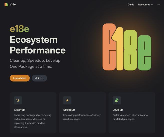
The JavaScript community has launched the e18e initiative to improve ecosystem performance by cleaning up dependency trees, speeding up critical parts of the ecosystem, and documenting lighter alternatives to established tools.
Socket now supports four distinct alert actions instead of the previous two, and alert triaging allows users to override the actions taken for all individual alerts.